How To Best Visualize And Organize Your Data
- Posted by agrAdminEGG
- On May 25, 2020
Introduction
To better understand the results of a business intelligence analysis, data has to be presented in the most effective way. Users must be able to identify the key information at first glance which makes your data visualization and organization crucial.
Improving your data visualization and organization, not only simplifies the search of information, but also increases its profitability. Studies on the cognitive processes of our brain show that our memory is able to assimilate information much more easily when we associate it with images or other graphic representations. However, this is not all. Apparently, even the choice of the colors can affect the assimilation of information in a different way.
In Business Intelligence, information should be represented in order to ensure a profitable interaction between the data and its users. A misleading graphic can have a negative impact on navigation and can easily undo all of your efforts. This is why, in this article we will see how to improve your data visualization and organization.
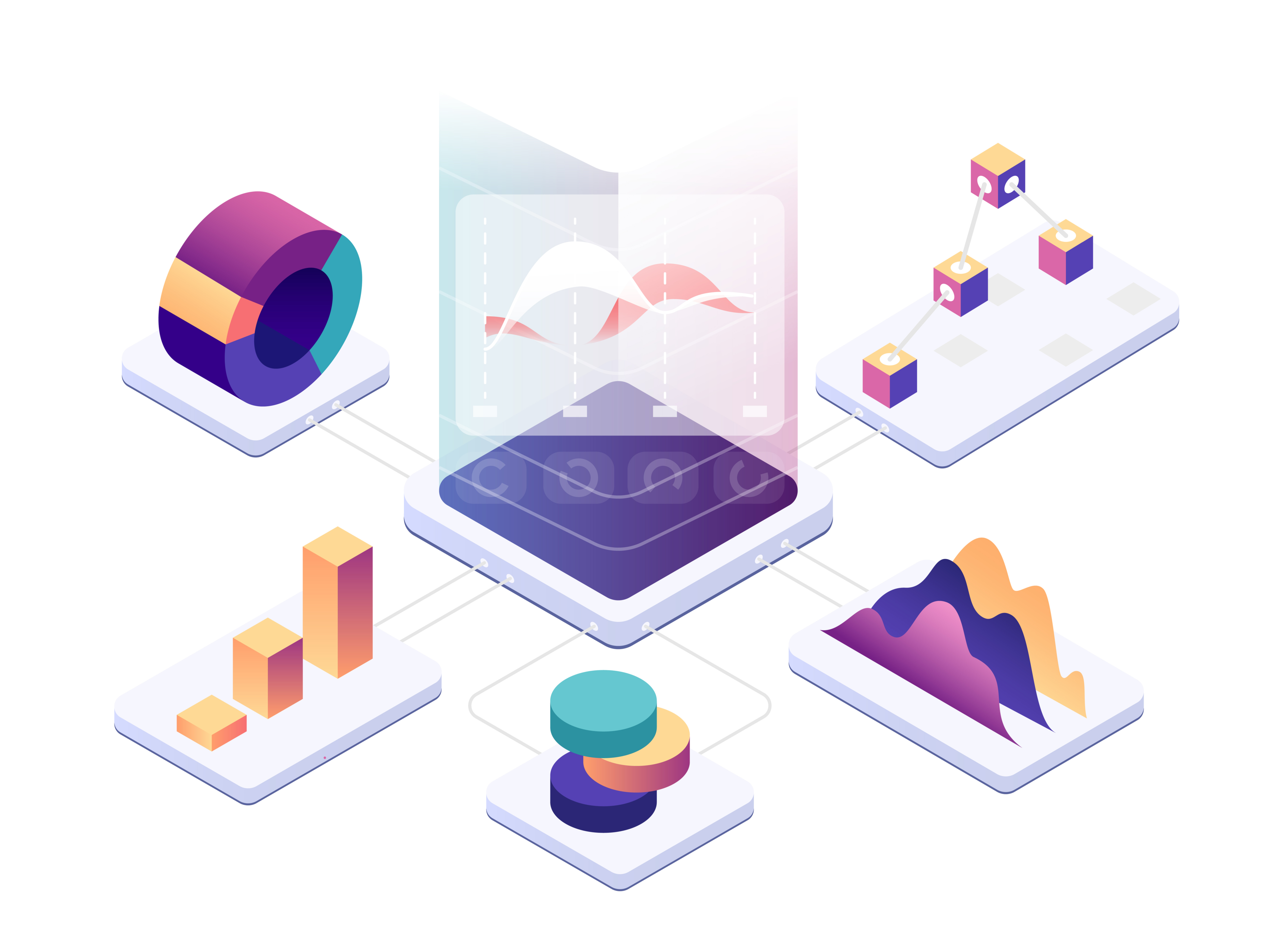
Choosing the Right Graph
The first step to visualize and organize your data correctly is making sure that you choose the right type of graph. There are many options out there and you must pay attention when matching each set of data to its appropriate graphic. At the end of the day, this choice will determine whether your data is accessible or not.
The bar chart:
This is one of the most common graphs and it makes the presentation of data highly intuitive. It can be used to represent trends, trends over time, historical maximums/minimums, to compare different categories or to represent volumes.
Pie chart:
In this case too we are talking about a very popular option and one of the most intuitive graphics. This is a classic example of visual data measurement. You can use this graph to represent the percentages and proportions in a category of data. In general, it becomes very useful when a minimum of two KPIs cover at least 30% of the total. If these conditions are not satisfied, the representation may not be read immediately.
Line chart:
This graph is particularly useful when you want to view data that changes over time, such as financial and historical data. Line graphs connect a contiguous series of points where each point represents a single measure. For this reason, they are widely used to show the evolution of data over a certain period of time. However, you can also use them to evaluate the area below the line.
Heat map:
This graph has a very high visual impact. It is generally used to make comparisons between two categories or evaluate the activation frequency by means of colors. Typically, users prefer sequential scales with shades of a single color. On top of being a colorblind-friendly choice, this will help you to keep it simple and easily interpretable.
Bubble chart:
This graph uses bubbles of different sizes to help users understand single point measurements. It is often associated with a map that contextualizes graphically what is under analysis. This map represents the area in which the element assumes a certain value. The radius of the bubble will then determine the value of each point.
Histogram chart:
This graph is generally used in very similarly to the classic bar chart. However, in this case users will find it easier to understand the underlying frequency distribution. In other words, this will help you to monitor a value within its set of data. In addition to this, you can also use different colors to get multiple information in a single view.
Gantt diagram:
This graph is very useful for planning a project and evaluating its progress over time. With this graph, you will get a complete view over some of the crucial points of a project. These include the presentation of all deliverables, the project deadlines, the chaining activities, or the division of the tasks.
Scatter plot:
This graph is used to evaluate the relationship between two variables within a Cartesian plane. Generally, it shows the influence of an independent variable over a second variable, by highlighting the effect of the relationship. Most frequently, a non-linear type will arise.
Funnel diagram:
The funnel chart is a type of chart that is often used to represent graphically the different stages in a process. For example, this type of graph can help a company identify the critical issues in their sales processes. In general, this graph is used when a process can be divided into at least 4 phases which gradually decrease as they progress.
At Prodigys, we know that these choices can be hard to make, but we are here to help you out! With AgrEGG you will have a wide range of graphs available, but you will not be left alone. Our team of analysts will help you keep your data tidy and always presented in the most efficient way.
Choosing the Right Colors
The second step for a correct data visualization and organization is choosing the right colors. Surely, you have to take into account technical reasons like paying attention to the contrast between text and background. However, colors also have social implications you should take into consideration, like the impact they have on your users’ emotions.
Normally, our mind associates a color with a specific interpretation. The most striking example is the use of red and green for negative and positive values.
Our top 3 advices for you are:
- never use a color that is in contrast with the message you want to convey
- do not exaggerate with the use of shades to avoid creating confusion
- seek uniformity to ensure continuity in the interpretation
You should remember that, an inappropriate choice of colors, might make your work ineffective or even counterproductive. If you choose AgrEGG, we will advise you on the correct use of colors. You will learn how to maximize the effectiveness of your data so that their interpretation is simple and intuitive.
Presenting Your Data Correctly
The third element to consider for a correct data visualization and organization is the way in which it is presented. In fact, you must take great care of this aspect.
A stunning design is not always a synonym of effective interpretation. Our top 3 advices for you on this matter are:
- don’t add too much information on one page. The user could be overwhelmed with data and fail to see important information.
- avoid unnecessary or unsolicited data altogether. Again, this could distract the user from what is important and overload them with useless information.
- keep it simple. The organization of your data should be linear and logical. You can organize and divide the data into sub-categories or even aggregate complementary information. This will both simplify storage and help your users navigate it more easily
With AgrEGG, your data will always be tidy. We can help you organize it in a logical order to make navigation easier and guarantee immediate reading. You can have all this, but with a personal touch so that it always answers to your specific needs.
Why AgrEGG?
Thanks to AgrEGG, you will not have to worry about data visualization and organization. Our team of experts will provide support in setting it up and keeping it running. A team of professionals will take care of the design. Your dashboards will be so captivating that they will make your presentations unique.
So, what are you waiting for? Get in touch with us today and choose AgrEGG.
The goal of a designer is to listen, observe, understand, sympathize, empathize, synthesize, and glean insights that enable him or her to make the invisible visible.
Hillman Curtis
0 comments on How To Best Visualize And Organize Your Data